If you've got here, you're either new to Vision and want to learn how to use Organisation Administration, or you've recently been promoted to an Organisation Administrator for your organisation. In either case, welcome! This article will help you familiarise yourself with navigating your way around this area.
Required time: 5 minutes
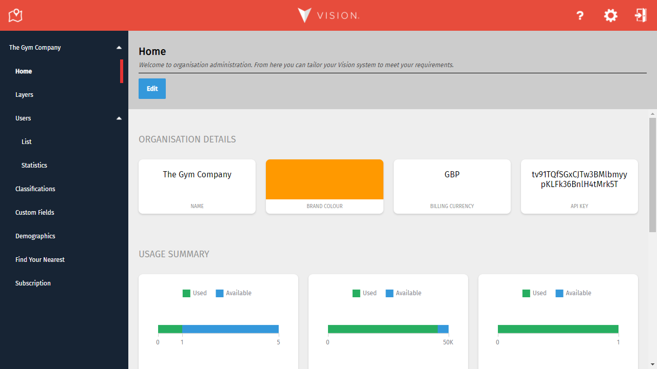
A typical landing page when entering Organisation Administration. We like to call this Home!
The navigation bar
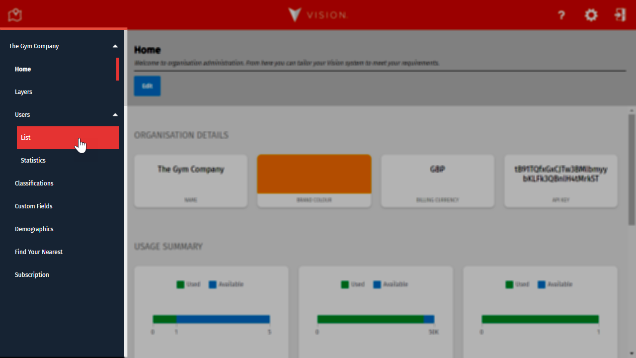
The navigation bar is highlighted above. It's the dark-blue bar running down the left-hand side.
The navigation bar allows you to select the content you want to manage by simply clicking on the relevant link. Sometimes, more than one link forms a group (notice the small arrow to their right). Clicking the group header will expand or contract the group. Your current content is displayed with a thin, red bar along the right-hand side.
Content pages
The rest of the page, to the right of the navigation bar, is where we display the content page you've selected. Each content page features a header that reminds you of your current location. Some pages also summarise what you can do, and there may also be action buttons relevant to that content.
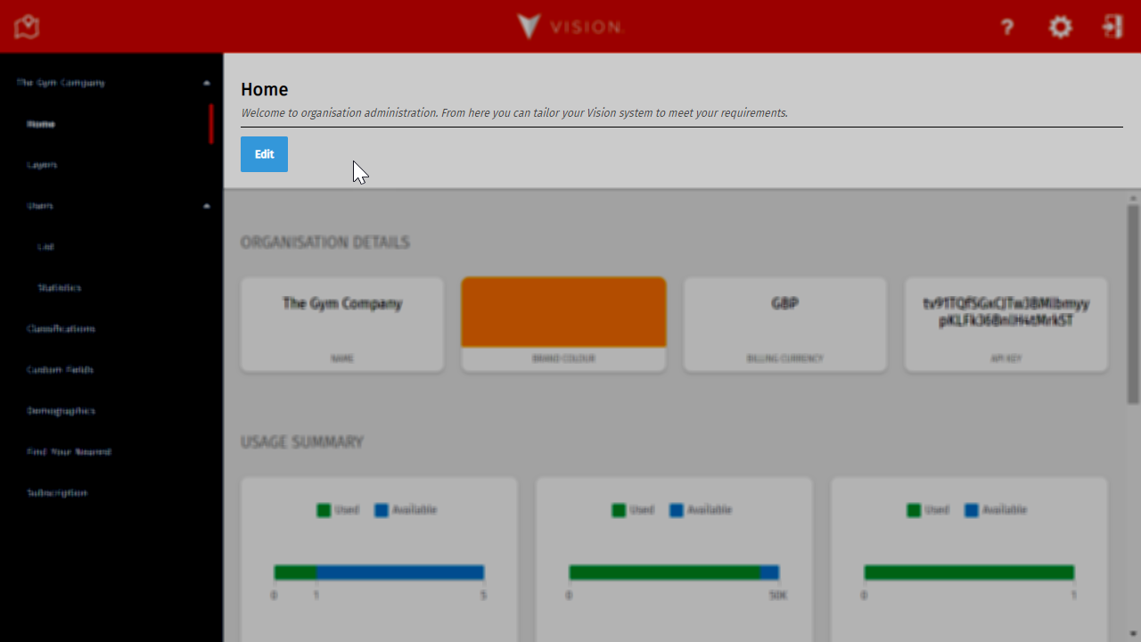
The header is highlighted above. Note the blue 'Edit' action button. This is placed at the top because it is relevant to the entire page.
Filtering
Some pages offer a filtering mechanism to help you find the item you want more quickly. In general, these filters operate on a name-contains basis (matching "tor" in "territories") and are not case-sensitive (matching "p" and "P").
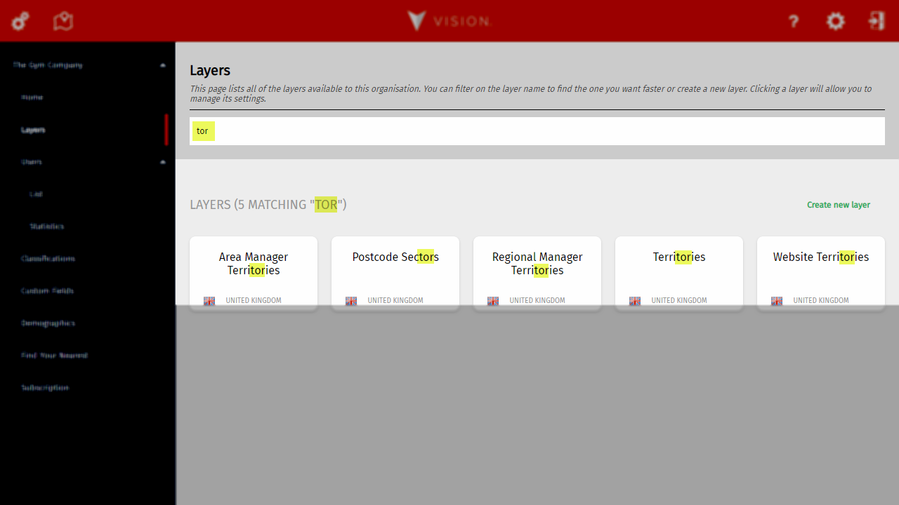
Content filtering lets you find what you're looking for. Faster.
Sections
Content pages display their data using grids which are organised into sections. These sections can also contain action buttons if they are relevant to that section only.
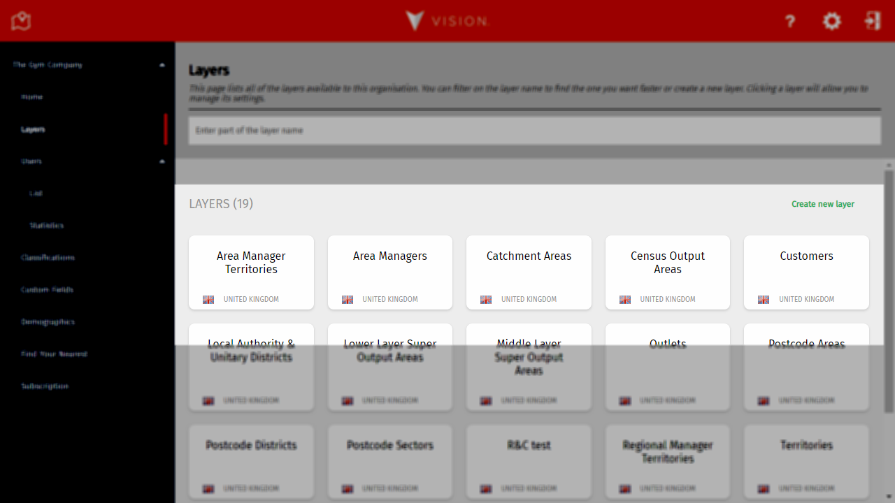
A section is highlighted above. Note how this section has a green 'Create new layer' action button.
Tiles
Data within a section is organised into tiles. For pages that provide a list of items, each tile represents an individual item and can usually be clicked to open a summary page for that item (such as a user or layer). On summary pages, tiles usually provide meaningful information on that item.
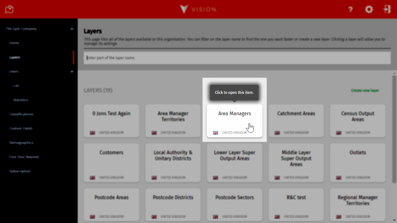
When a tile acts as a portal to a summary page for an item, hovering over it will tell you it can be clicked on.
Sometimes, tiles can be clicked on to copy their value to your clipboard. This is typically implemented for tiles that provide values that may need to be copied for use elsewhere (such as API keys).
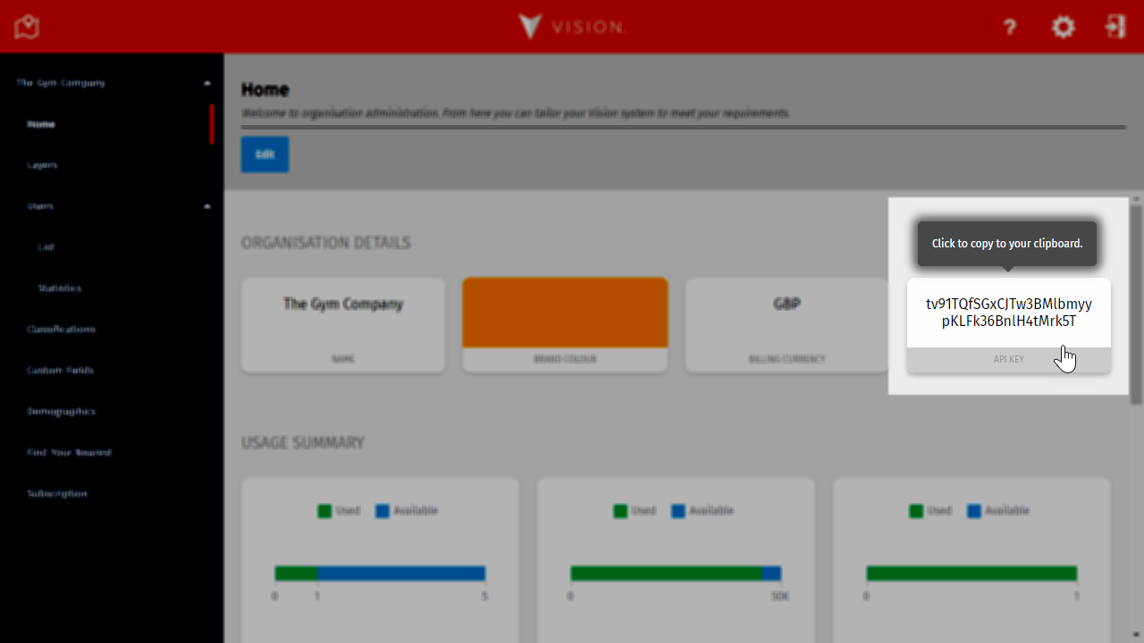
When a tile's value can be copied, hovering over it displays a prompt, as highlighted above.
Making changes
Whenever you want to create or edit something, Vision guides you through the process step-by-step using intuitive wizards. And, if you change your mind halfway through, you can even go back without losing everything you've done past that point by clicking on the appropriate step in the left-hand progress bar.
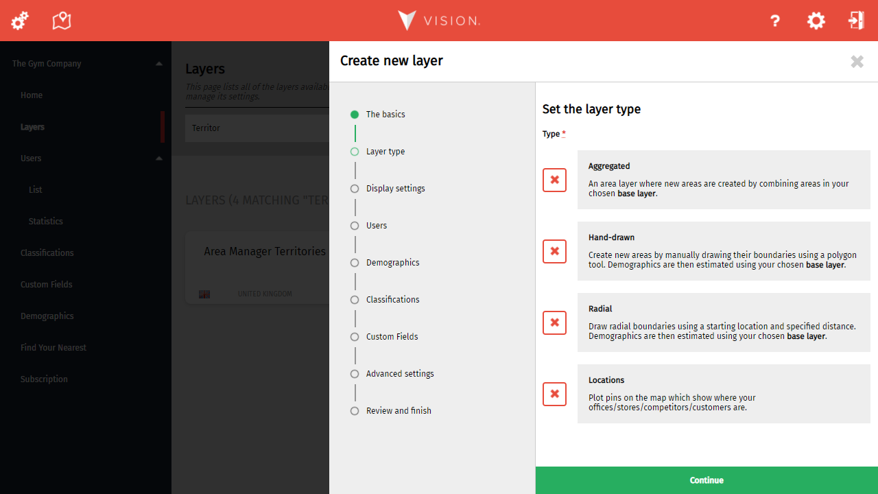
Vision's step-by-step wizards guide you through each process, providing clear explanations for options and notifying you when you've made an error.
Once you've reached the end, most processes include a Review and finish page, providing a summary of key changes you've made - just for that extra piece of mind before you press save.